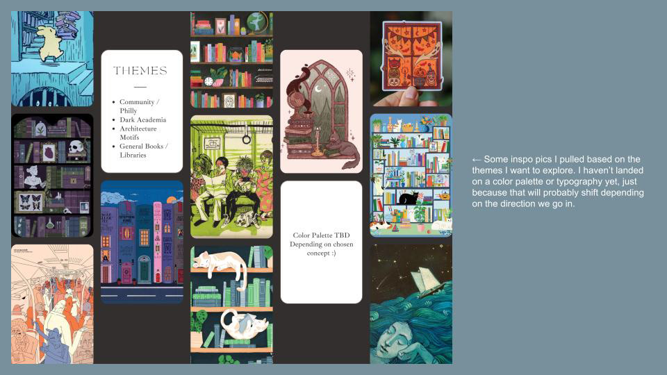
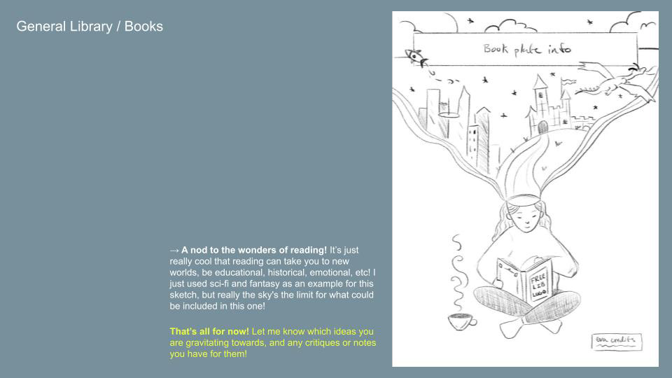
Project Overview
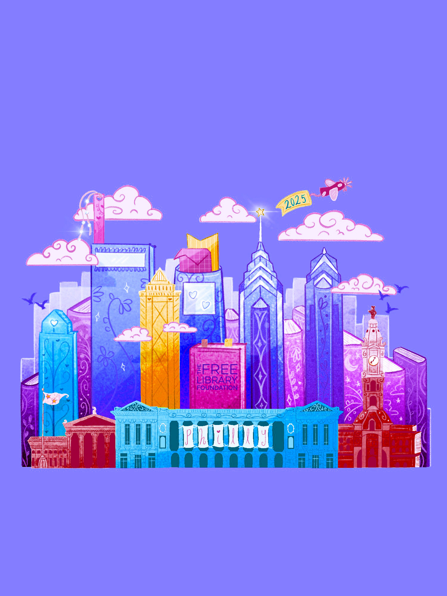
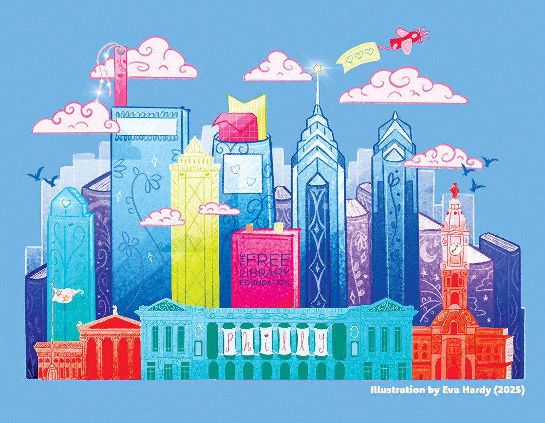
This Donation Bookplate Campaign was created for the Free Library of Philadelphia Foundation to celebrate reading, community, and the impact of charitable support. The centerpiece of the campaign is a custom illustration developed in two distinct colorways: one for the official donor bookplate and another adapted for supporting merchandise and digital applications.
The final artwork was extended across a cohesive set of campaign assets, including stickers, tote bags, bookmarks, and email banners, creating a unified donor experience across both physical and digital touchpoints.
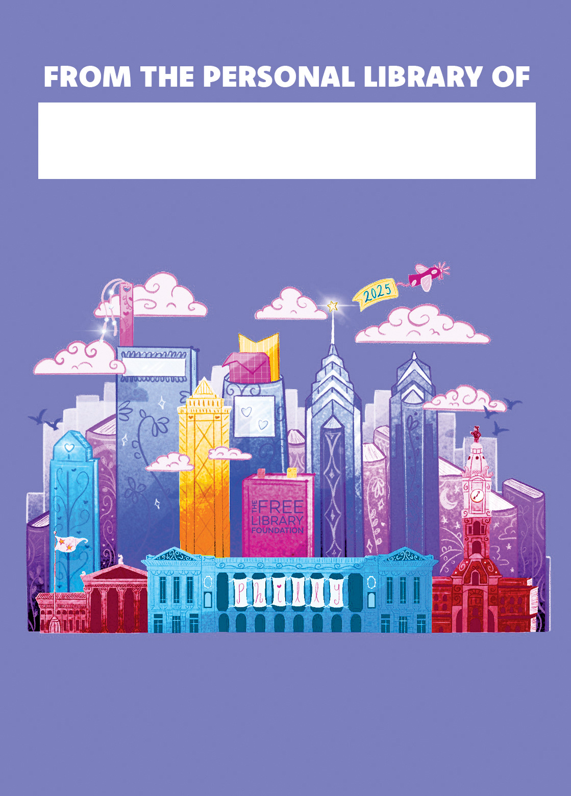
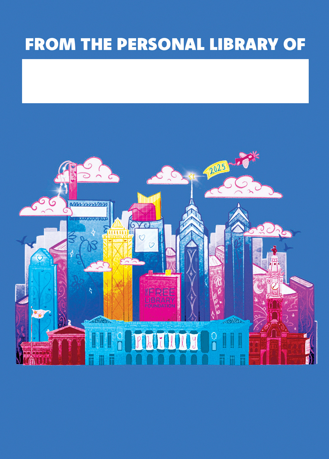
Purple Colorway for the Main Bookplate Design
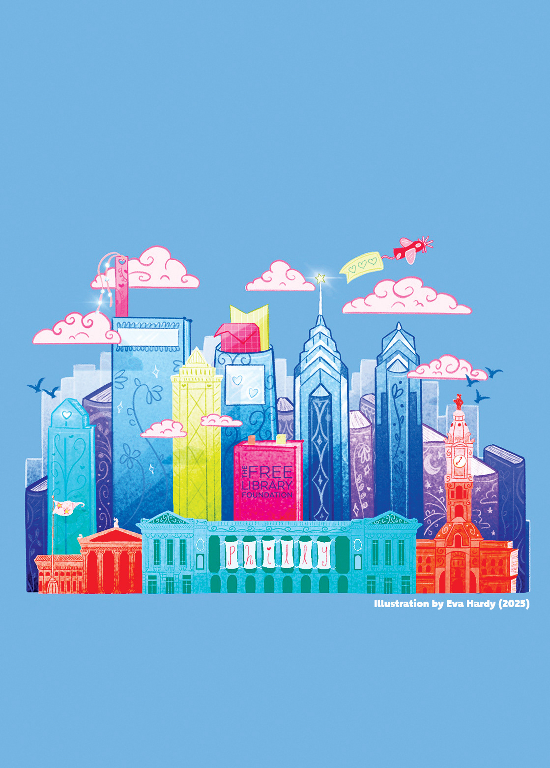
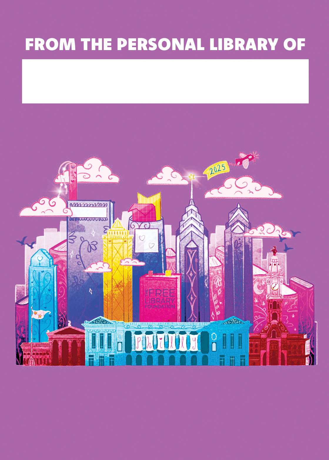
Blue Colorway for the Supporting Merchandise
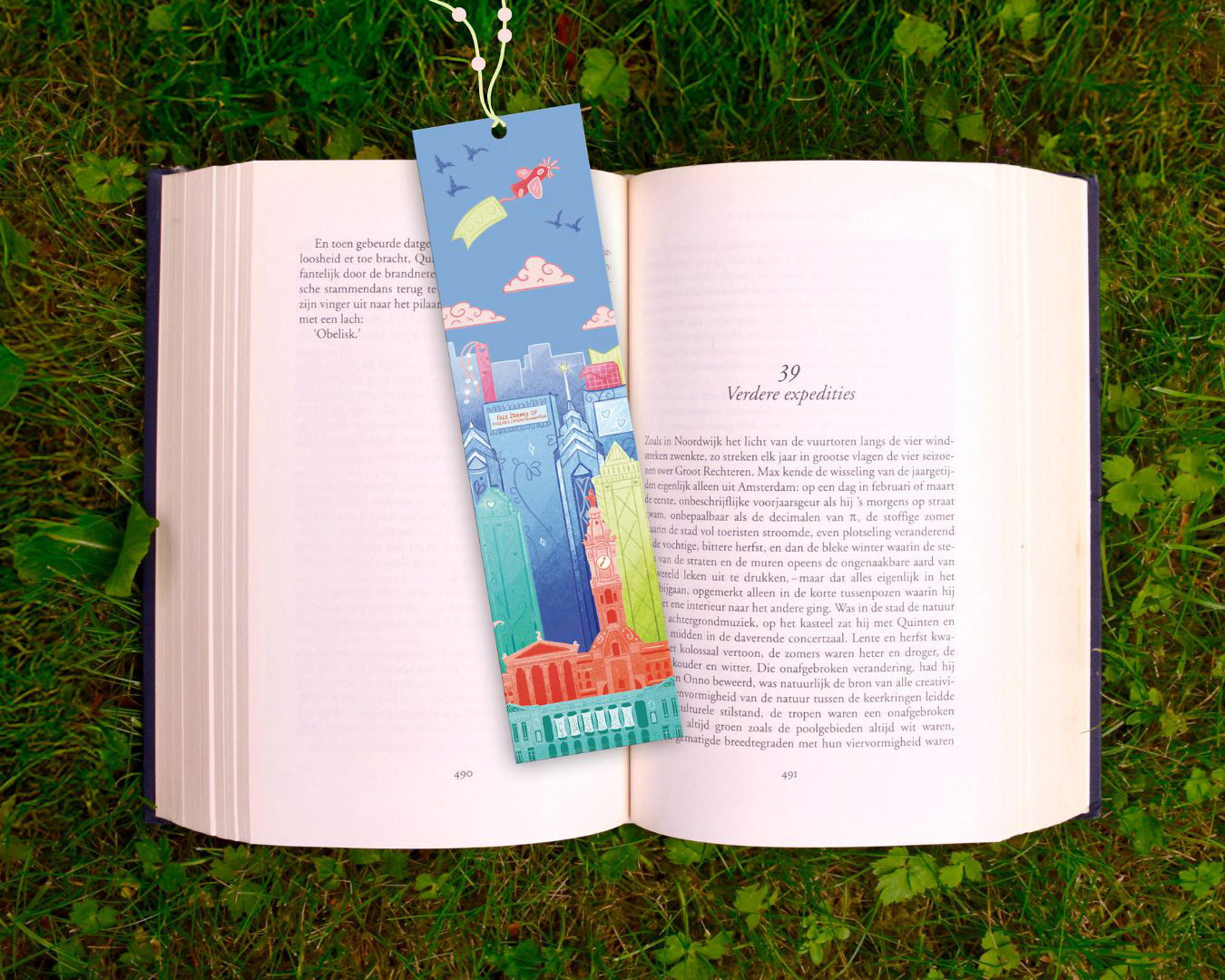
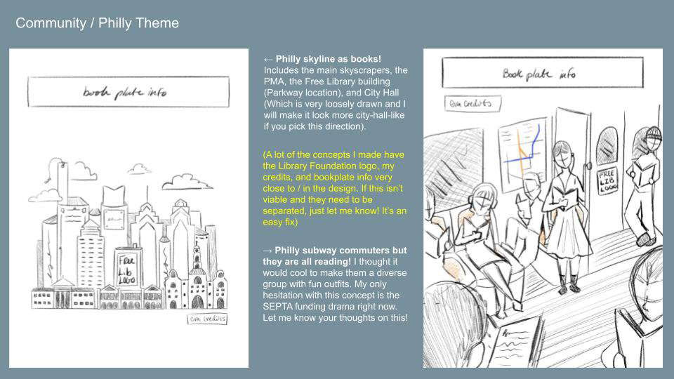
The illustration reimagines the Philadelphia skyline through a book-inspired lens, transforming familiar Philadelphia landmark buildings (City Hall, the Art Museum, and the Parkway’s main Free Library location) into architectural 'books'.
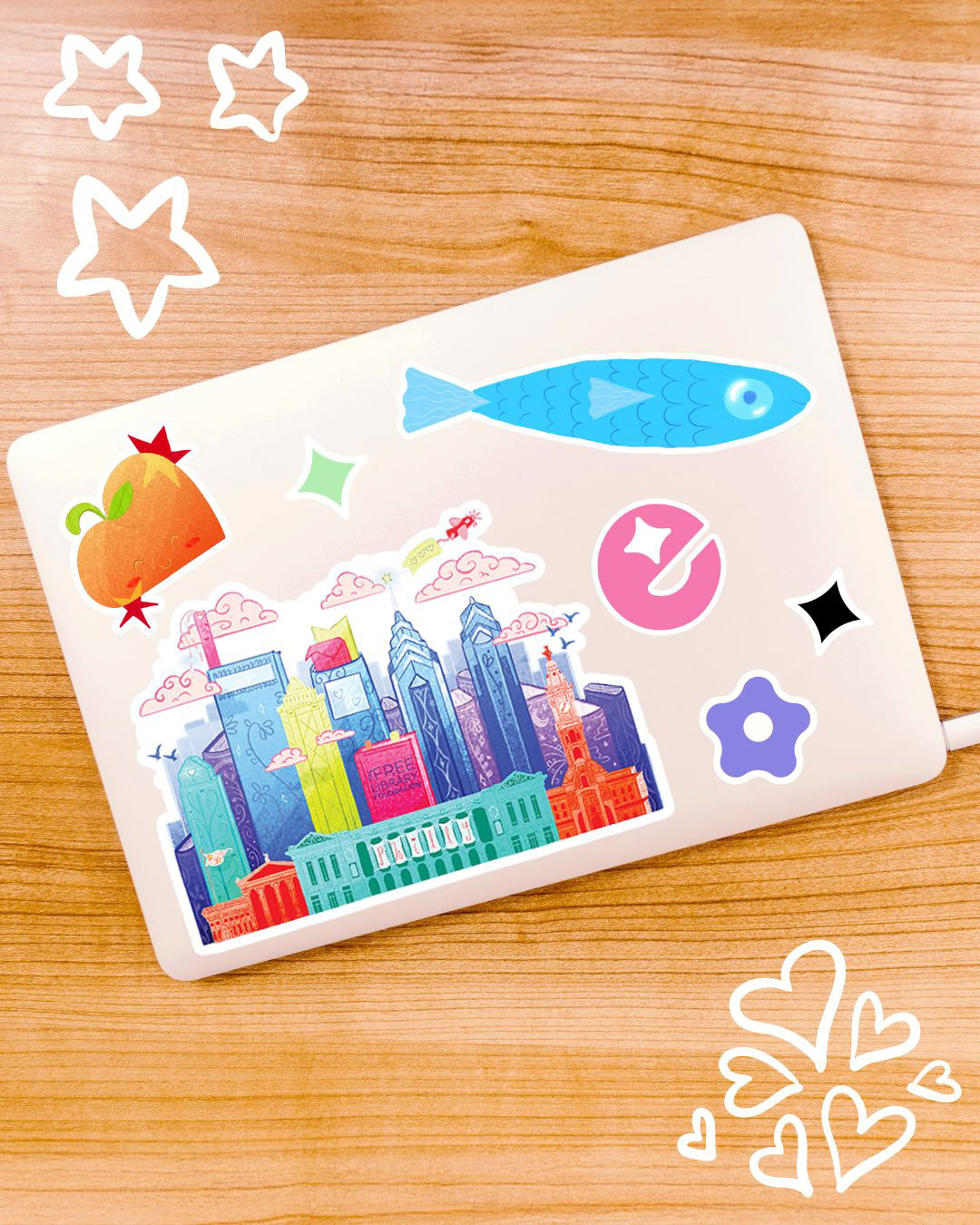
Sticker Mock-up
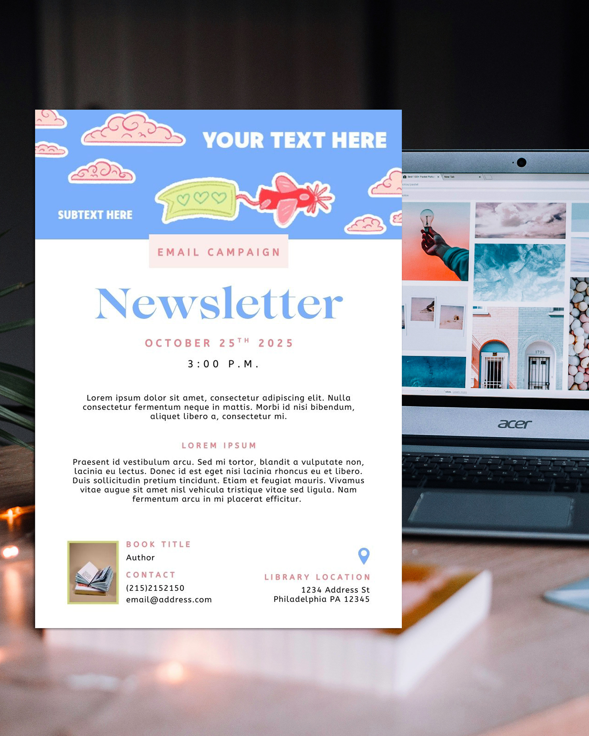
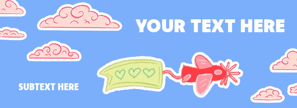
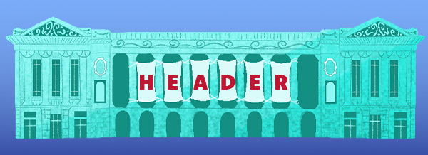
Email Banner Mock-up
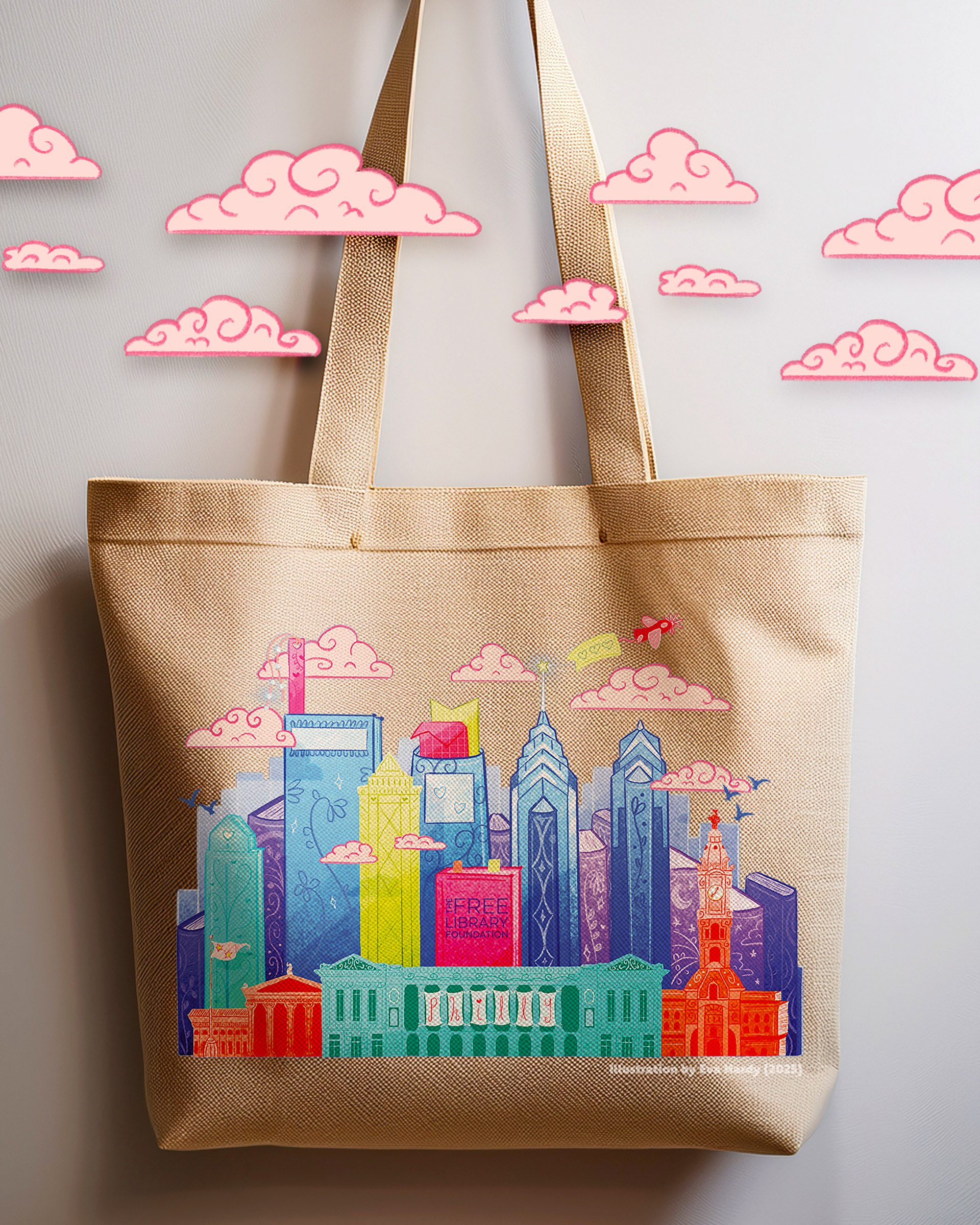
Tote Bag Mock-up
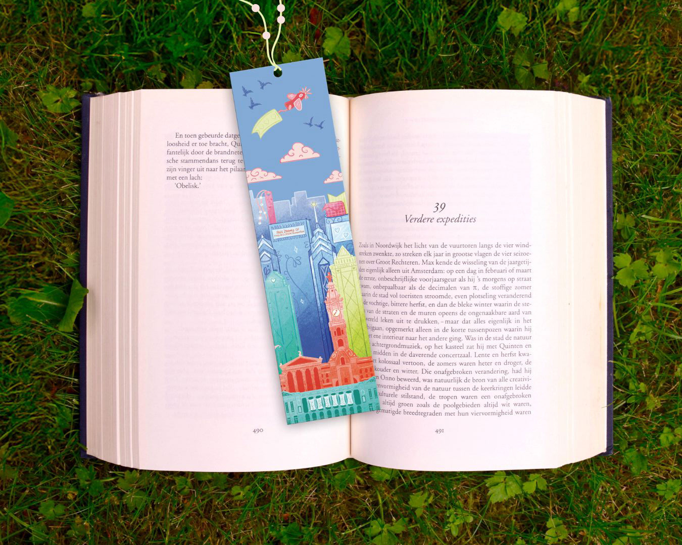
Bookmark Mock-up
Designed to evoke whimsy and the magic of reading, the visual system connects the joy of storytelling with the Foundation’s mission to serve and enrich Philadelphia’s communities.
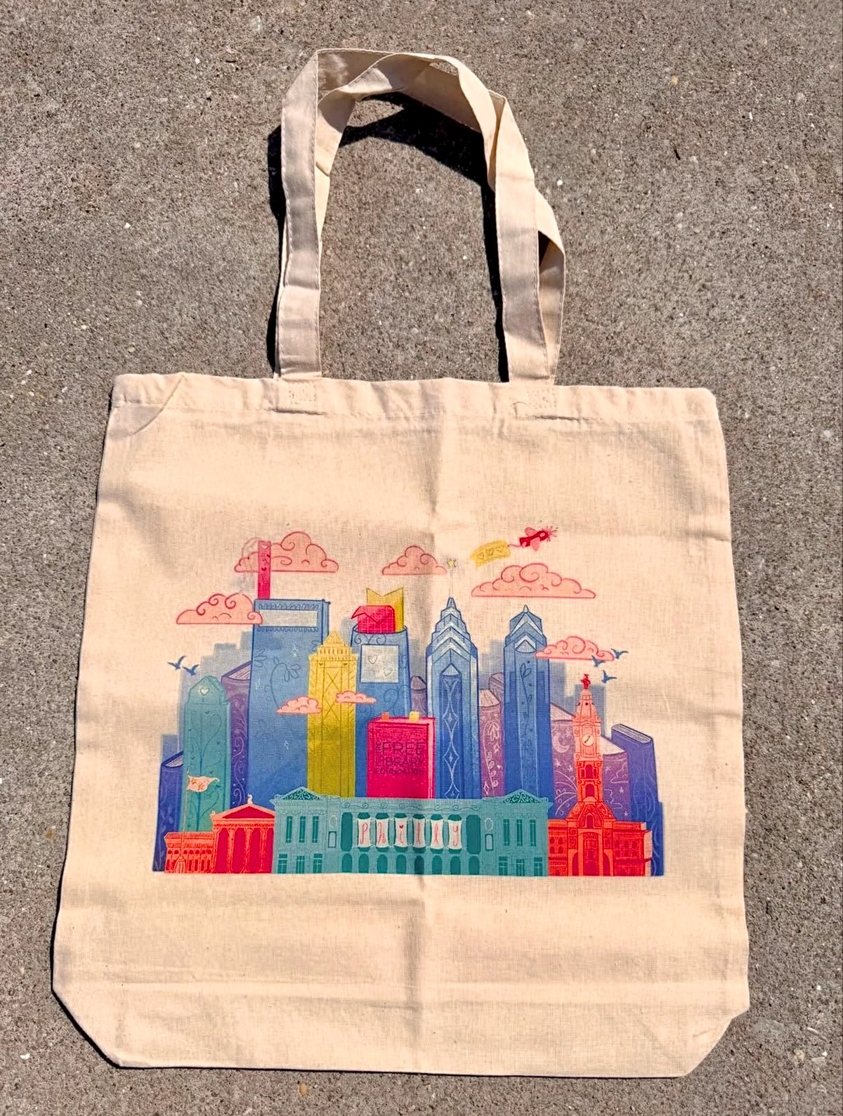
Real-World Tote Bag (Photo Credits: Free Library of Philadelphia Foundation Instagram)
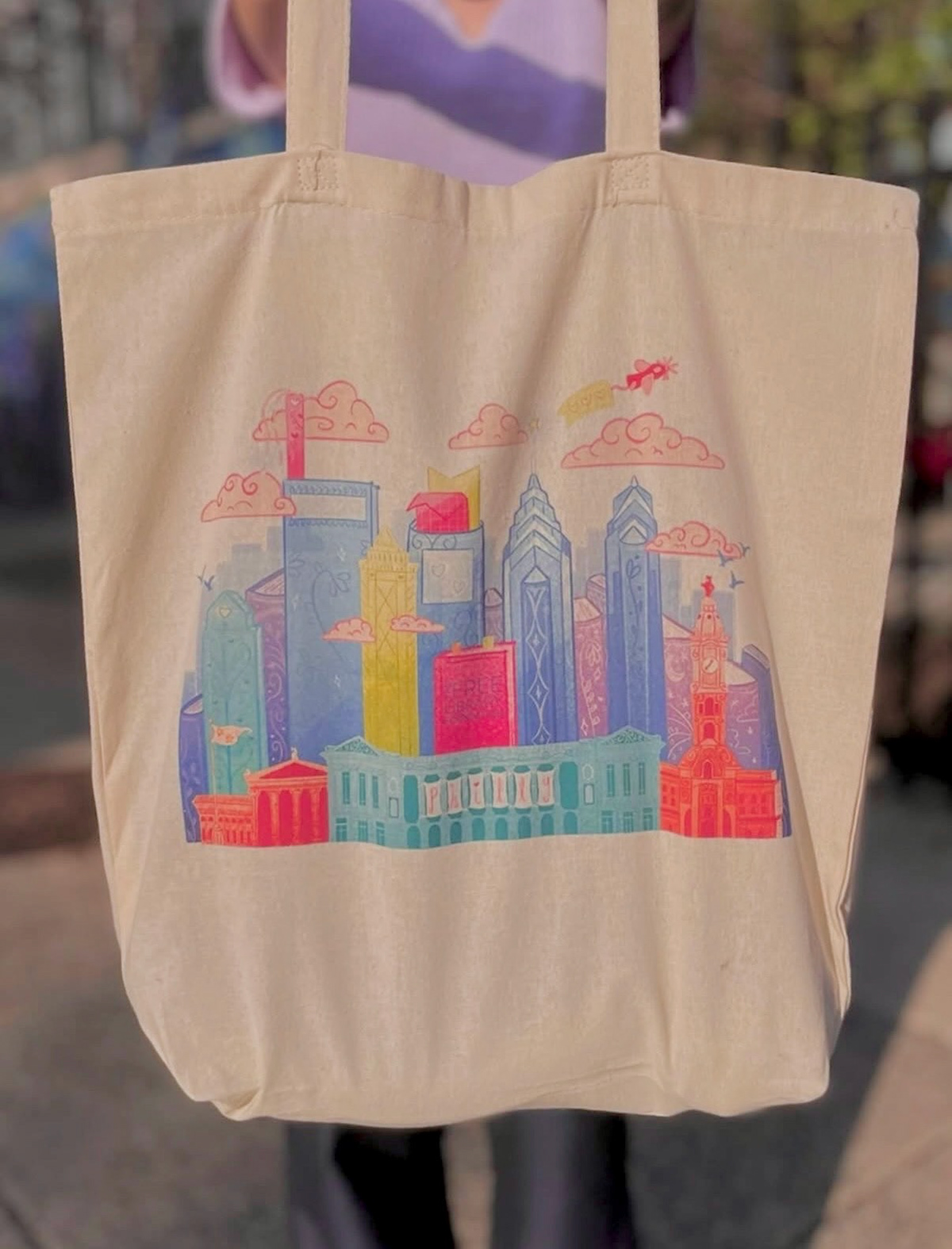
Real-World Tote Bag (Photo Credits: Free Library of Philadelphia Foundation Instagram)
Plane Email Banner

Seasonal October Email Banner
Parkway Location Email Banner

Sky Email Banner
Email Banner Designs
Select elements from the primary illustration were isolated and reconfigured into a series of on-brand email banner compositions.
Original RGB Design

Chosen CMYK Conversion
Cyan-leaning Conversion
Magenta-leaning Conversion
Printer Challenges & Take-Aways
This project became an important learning moment in digital-to-print color production for me. The original bookplate was designed in a vibrant violet palette that the client loved (image left), but converting the artwork from RGB to CMYK resulted in unexpected desaturation.
As a designer who was never taught professional printing procedures due to the constraints of online learning during the pandemic, this was my first major print project post-graduation!
I used the challenge as an opportunity to deepen my understanding of CMYK workflows. Through testing and refinement, I developed multiple CMYK-safe colorway options, allowing the team to choose a final direction that preserved the spirit of the original design while ensuring successful print results.
And I now know to design in CMYK from the start for future print projects!
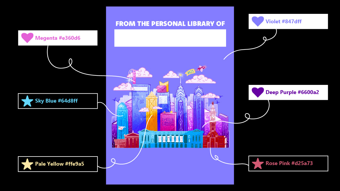
Bookplate Colorway RGB Palette
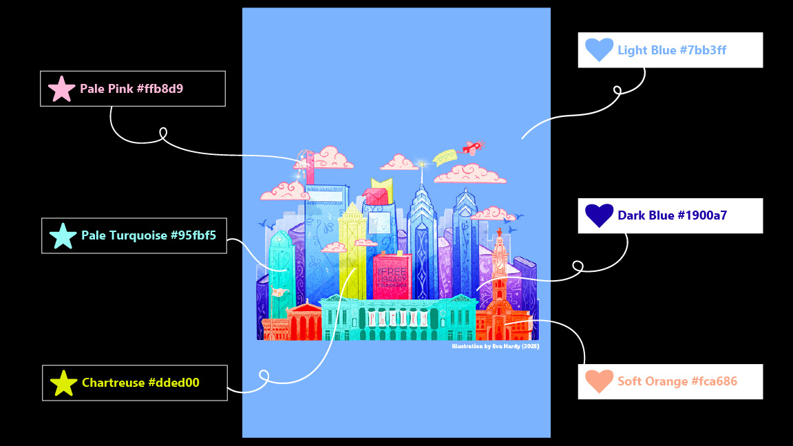
Merchandise Colorway RGB Palette
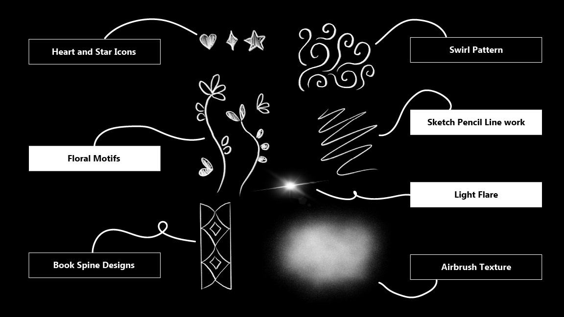
Texture, Brush, & Pattern Pack
Illustration-Led Brand Guidelines
While this project was centered on a single illustration rather than a full identity system, I was asked to develop a brand guide to ensure visual consistency across all campaign materials.
Without a predefined color palette or icon system, I identified the most prominent hues within the illustration and refined them into a cohesive working palette. I also extracted small illustrative elements to function as flexible iconography and supporting graphics (see email banners).
And to further support the campaign’s rollout, I created a small texture, line-work, and pattern library derived directly from my digital brushwork and illustration style.
This process allowed the illustration to function as a scalable visual system, giving the client clear tools to maintain cohesion across future assets.
Project Specs
Client: The Free Library Foundation of Philadelphia
Timeline: Summer - Fall 2025
Location: Philadelphia, PA
Project Type: Illustration, Brand Campaign
Role: Lead Illustrator/Designer & Art Direction
Tools & Resources
Programs Used: Adobe Photoshop, Apple Procreate, Canva (Mock-ups)
Resources: Adobe Fonts, UnSplash
* * *